
Whether you’re tweaking app preferences or managing account configurations, the settings page is often one of the most visited yet overlooked elements of most digital products. Despite its functional role, a well-designed settings page can enhance usability, reduce cognitive load, and increase user satisfaction. In this article, we’ll explore the principles, patterns, and practical tips involved in designing clear, efficient, and user-friendly settings pages.
The Key Role of Settings Pages
Settings pages serve as control centers—places where users can refine their product experience, set up notifications, change privacy permissions, or tweak accessibility options. What’s remarkable is how crucial these pages become, especially for power users or individuals with specific needs. However, if poorly designed, a settings page can become a frustrating maze. A clearly structured and thoughtfully presented settings interface empowers users to take control without confusion or error.
Main Principles of Clear Settings Page Design
Creating an effective settings page isn’t just about putting all options in one place—it’s about making complexity manageable and intuitive. Here are some foundational principles:
- Clarity Over Completeness: Users prefer a few clear options over a comprehensive list that’s tough to navigate. Prioritize what matters most.
- Logical Grouping: Group related settings together to reduce hunting and pecking. Use labels and chunking for better legibility.
- Consistent Language: Use recognizable terms and avoid jargon. Consistency across menus aids recall and speeds up task completion.
- Minimal Cognitive Load: Keep the design minimal yet helpful. Information hierarchy should guide the user’s eyes naturally.
Structuring the Page Effectively
Good structure prevents user overwhelm and allows for faster decision-making. Depending on the app or website’s complexity, a settings page may consist of multiple sections or be a single scrollable list. The key is how you organize the content.
Here are common structural patterns:
- Tabbed Interface: Tabs work well when you have a limited set of major categories. They allow users to skip directly to the section they need.
- Collapsible Sections: Especially useful for settings-rich environments. These keep the interface tidy while offering details on-demand.
- Sidebar Navigation: Larger applications benefit from a sidebar that lists categories vertically, making browsing more intuitive.

Language Matters: Microcopy and Labels
Decoding settings should never feel like reading tax forms. The clarity of your copy—both for headers and toggle labels—can make or break the user experience. Avoid technical terms unless your audience demands it. Instead of using “Telephony Settings,” say “Call Settings.” Provide context where appropriate. Many users appreciate brief hints such as “Automatically updates over Wi-Fi” placed under toggles.
Here are key linguistic tips:
- Use Action Verbs: Labels like “Send Reports Automatically” are actionable and easy to understand.
- Be Concise: Keep text short but meaningful. One-line descriptions are often ideal.
- Show Status Clearly: Use toggles or switches accompanied by clear on/off indicators. Make sure the current selection is visually obvious.
Visual Hierarchy and Typography
Visual hierarchy is about guiding the user’s attention, and nothing matters more when you’re organizing 10 different settings on one screen. Use font weights, colors, and spacing to differentiate between category titles, options, and descriptions.
Typography tips include:
- Use a Larger Font for Section Headers: This helps divide the page effectively.
- Maintain Consistent Spacing: Equal padding between elements prevents cluttered layouts.
- Ensure Readability: Minimum 14–16px font size is recommended for mobile devices.

Interactive Elements That Make a Difference
Buttons, sliders, toggles, and dropdowns—these interactive elements must be intuitive and finger-friendly. Consider mobile-first design patterns if your user base interacts primarily on mobile devices. Each control should have a predictable behavior and give instant feedback upon interaction.
Good practices include:
- Use Toggles for Binaries: Yes/No or On/Off options should always be handled with toggles.
- Dropdowns for Multiple Options: Great for selections like language or time zone.
- Progressive Disclosure: Show advanced settings only when necessary. This keeps first impressions clean while still offering depth.
Personalization vs. Complexity
Offering customization is great—until it gets too complex. Consider which settings could be intelligently pre-set with defaults based on user behavior or onboarding choices. Too many decisions can paralyze a user, so the trick lies in offering meaningful rather than excessive options.
One technique is the use of smart defaults: options preset in a user’s best interest that remain easily changeable. Another approach is recommending settings based on how users already use the app. For example, if a user rarely receives notifications, suggest limiting alerts instead of letting them find that option themselves.
Accessibility and Inclusive Design
Accessible design ensures everyone, regardless of ability, can use your settings page. This includes screen reader compatibility, high contrast visuals, and keyboard/tab navigation. For mobile, touch targets should be at least 48x48dp, and labels should be screen-reader friendly.
Accessibility checks to consider:
- Label All Input Fields: Especially for checkboxes and toggles.
- Provide Text Alternatives: Icons and images must have alt attributes if they convey important information.
- Test with Assistive Technology: Make it a habit to test settings pages with screen readers or keyboard-only navigation tools.
Testing and Iteration
Even a well-designed settings page may have usability issues you didn’t anticipate. Usability testing is critical to understanding how users navigate the layout and comprehend the language. Use A/B tests to determine the most effective structure and continuously iterate based on feedback.
Some common test objectives might include:
- Time taken to locate a specific setting
- Success rate on completing a configuration task
- User satisfaction and clarity ratings through surveys
Examples of Excellent Settings Design
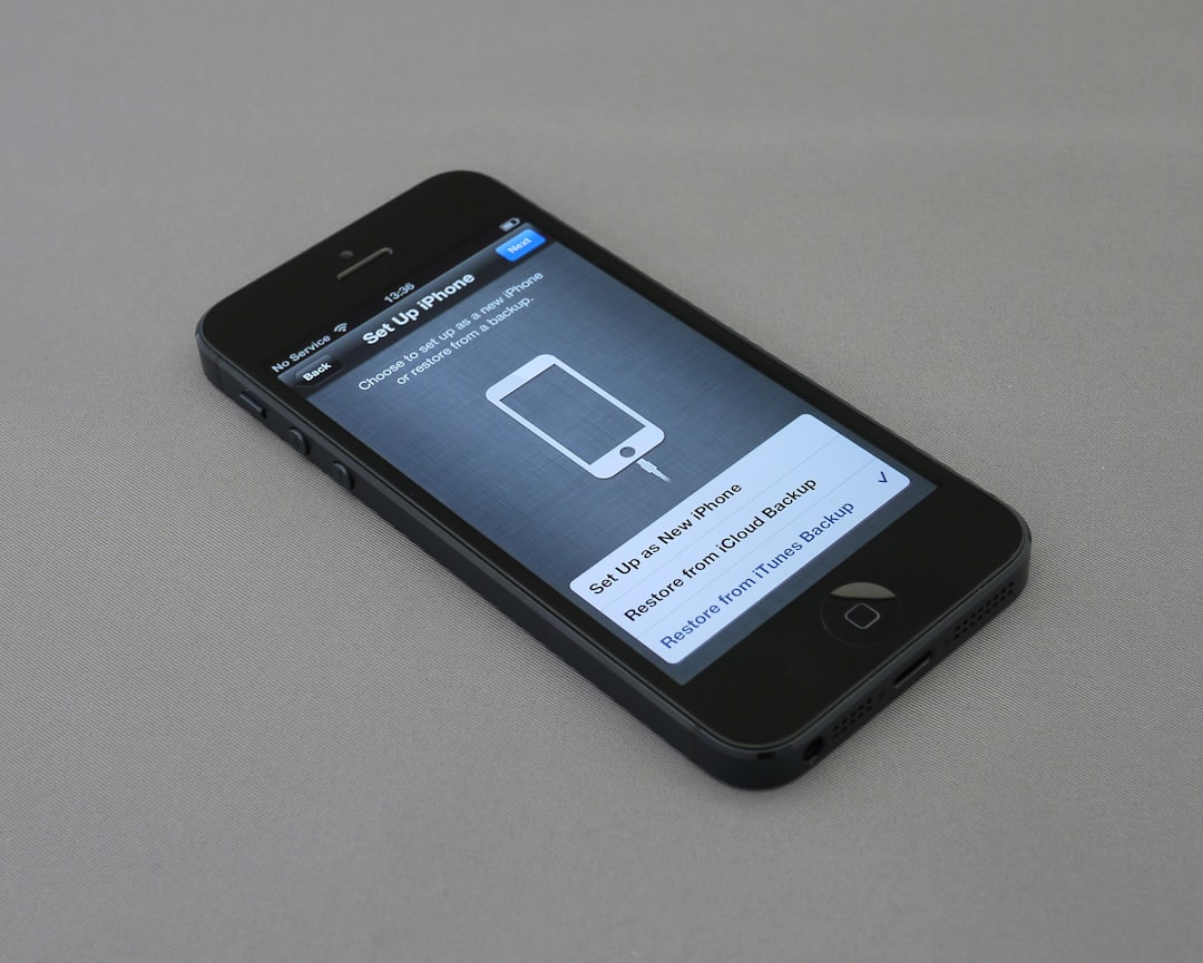
Want inspiration? Look at Apple’s iOS Settings, Google’s Material Design settings pages, or apps like Slack and Dropbox. These products balance clarity and power beautifully, offering a model you can build upon.
Common threads among them include:
- Prominent search capabilities within settings
- Use of icons and visual cues for faster scanning
- Clear hierarchy and progressive disclosure for advanced options
Final Thoughts
Settings pages are so ubiquitous that it’s easy to sweep them under the rug. But users deeply appreciate—and often expect—a clear, responsive, and comprehensible settings interface. Thoughtful design here shows attention to detail and respect for your users’ need for control.
Try to see your settings page as a product inside a product—one that deserves just as much care as your homepage or onboarding. By focusing on structure, clarity, interaction, and testing, you can transform a mundane feature into a powerful part of your UX strategy.