
In wellness branding, a logo is not merely a decorative mark. It is a signal of safety, calm, professionalism, and emotional clarity. For brands built around meditation, therapy, spa services, holistic health, mental fitness, recovery, yoga, or mindful technology, the visual identity must communicate trust before a person reads a single word. A Calm Waters AI logo concept draws from the quiet strength of water: balance, flow, depth, reflection, and renewal.
TLDR: A Calm Waters AI logo uses minimalist design principles to help wellness brands appear calm, credible, and modern. The best concepts combine soft water-inspired forms, restrained typography, balanced spacing, and a trustworthy color palette. For wellness businesses, this approach can create a visual identity that feels professional without becoming cold, and peaceful without seeming vague or generic.
The Meaning Behind Calm Waters in Wellness Branding
Water has long been associated with healing, emotional release, clarity, and restoration. In a wellness context, calm water represents the state many clients are seeking: a quieter mind, a steadier body, and a deeper sense of inner order. When translated into logo design, these ideas can become powerful visual cues.
A Calm Waters AI logo does not need to show a literal lake, wave, or droplet. In fact, the most effective minimalist branding often works through suggestion rather than illustration. A single curved line can imply a ripple. A soft circular form can suggest reflection. A carefully spaced symbol can create the feeling of openness and breath.
For wellness brands, this matters because audiences are often making emotionally sensitive decisions. They may be choosing a therapist, a meditation platform, a retreat center, a health coach, or a spa. The logo should reduce uncertainty. It should say, quietly and confidently, this is a place where you can feel grounded.
Why Minimalism Works for Wellness Brands
Minimalism is especially effective in wellness branding because it removes visual noise. Many wellness customers are already overwhelmed by choice, stress, and digital clutter. A simple identity can feel like relief. It creates a pause.
However, minimalist does not mean empty or unfinished. A serious minimalist logo must be carefully constructed. Every curve, line weight, letterform, and color choice carries meaning. When done well, minimalism communicates maturity, discipline, and confidence. When done poorly, it can appear generic or impersonal.
For a Calm Waters AI logo, minimalism should support three core goals:
- Clarity: The logo should be understandable at a glance, even at small sizes.
- Calm: The visual rhythm should feel balanced, soft, and unforced.
- Credibility: The identity should look professional enough for health, wellness, and care-related services.
This balance is essential. A wellness brand may want to appear gentle, but it should not appear fragile. It may want to seem modern, but not clinical in a cold or distant way. Minimalism allows the brand to occupy that middle ground with precision.
Core Visual Concepts for a Calm Waters AI Logo
A strong Calm Waters AI logo can be developed around several visual directions. Each direction carries a slightly different tone, and the right choice depends on the brand’s audience, services, and positioning.
1. The Ripple Mark
A ripple is one of the clearest symbols of calm water. In logo form, it can be represented by concentric circles, soft horizontal curves, or a single expanding line. For meditation and mindfulness brands, the ripple can suggest the effect of one calm thought spreading through the mind. For therapy or coaching, it may represent gradual transformation.
The key is restraint. Too many lines can make the mark feel busy. A minimalist ripple should be simple enough to remain recognizable when reduced to a small app icon or social media profile image.
2. The Horizon Line
A still water horizon is powerful because it naturally creates a sense of balance. A logo using a horizontal line, semi-circle, or gentle division between sky and water can feel stable and contemplative. This concept is particularly suitable for retreat centers, wellness resorts, breathwork studios, and premium spa brands.
The horizon concept also works well with elegant typography. A refined wordmark paired with a subtle waterline can create an identity that feels established and serene.
3. The Droplet and Circle
The droplet is widely used in health, beauty, and wellness branding. To avoid looking overly familiar, it should be interpreted with care. A droplet inside a circle, a droplet formed through negative space, or a droplet merged with a leaf or human form can add originality.
For brands that combine wellness with technology, the circular droplet can also suggest precision, data, and intelligent personalization. This is where the “AI” element becomes relevant. The design can hint at technology without relying on predictable circuit patterns or robotic imagery.
4. Abstract Flow Forms
Abstract flowing shapes can communicate movement, emotional release, and adaptability. These marks are useful for brands that do not want to be limited to one service category. A mental wellness platform, for example, may offer meditation, journaling, coaching, and mood tracking. An abstract water-inspired logo can represent the broader promise of guided personal balance.
Image not found in postmeta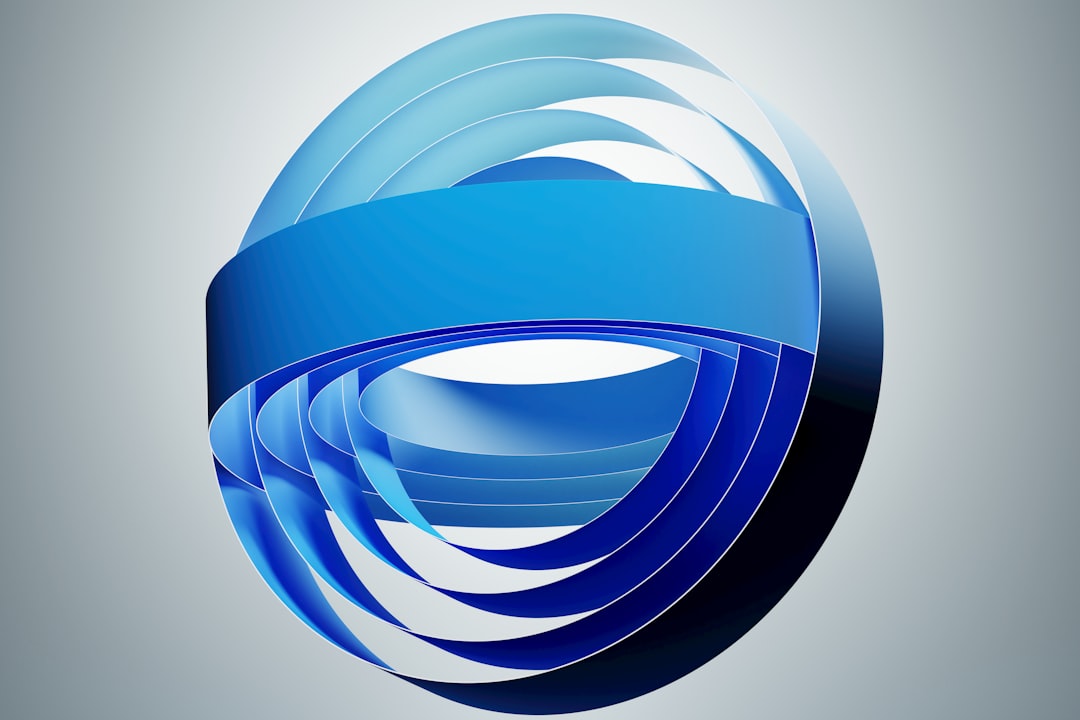
Color Palettes That Build Trust
Color is one of the most immediate ways to shape perception. For Calm Waters AI branding, blue is the natural starting point, but not every blue communicates the same message.
- Soft blue: Suggests calm, breath, openness, and emotional ease.
- Deep navy: Adds authority, seriousness, and clinical trust.
- Blue green: Connects water with nature, renewal, and holistic care.
- Warm gray: Provides neutrality and sophistication without harshness.
- Off white: Creates space, purity, and a quiet premium feeling.
A trustworthy wellness logo should avoid colors that feel too aggressive or overstimulating. Bright red, harsh neon tones, or overly saturated gradients may create tension rather than calm. That said, a subtle gradient can work well if it resembles natural light on water. The result should feel refined, not decorative.
High contrast is also important for accessibility. Wellness brands often serve diverse audiences, including people who may be viewing content on small screens or in stressful circumstances. A logo must remain legible and clear across websites, mobile apps, signage, printed materials, and social platforms.
Typography: Quiet Confidence Matters
Typography can make or break a minimalist wellness logo. A calm symbol paired with the wrong typeface can create confusion. For example, a playful handwritten font may undermine credibility for a mental health platform. A rigid geometric font may feel too cold for a massage therapy practice.
The best typographic choices usually fall into three categories:
- Humanist sans serif: Clean, modern, and approachable, with subtle warmth.
- Elegant serif: Suitable for premium wellness, retreats, and high-end spa brands.
- Soft geometric sans serif: Useful for wellness technology, apps, and AI-supported health tools.
Spacing should be generous. Tight letter spacing may feel tense, while overly wide spacing can appear disconnected. The goal is to create a wordmark that feels composed and easy to read. In serious wellness branding, legibility is part of trust.
How AI Influences the Logo Concept
The phrase “AI logo” can refer to a logo created with artificial intelligence, a brand that uses artificial intelligence, or both. In either case, the final identity should not look automated. A wellness brand should never feel like it has outsourced its emotional intelligence to a machine.
If the brand itself uses AI, such as a mental wellness app, personalized meditation guide, sleep support platform, or digital coaching service, the logo should balance innovation with humanity. The design can suggest intelligence through symmetry, precision, modular spacing, or subtle systematic patterns. But it should remain soft enough to feel caring.
Common technology clichés should be used cautiously. Circuit lines, microchip icons, and glowing digital effects can make a wellness brand feel more like software infrastructure than personal support. A stronger approach is to combine calm organic forms with precise minimalist structure. This creates a bridge between human wellbeing and intelligent systems.
Brand Applications and Consistency
A Calm Waters AI logo must work beyond the main website header. A responsible brand identity should be tested across practical uses before it is finalized.
- Mobile app icon: The symbol must remain clear at very small sizes.
- Social media avatar: The mark should be recognizable inside a circle or square crop.
- Website navigation: The logo should not dominate the page or compete with content.
- Printed materials: Business cards, client forms, packaging, and brochures need clean reproduction.
- Signage: Spa, clinic, studio, or retreat signage requires strong visibility from a distance.
Consistency is especially important in wellness. Clients and customers often return to brands that feel reliable. If the logo appears differently across platforms, the brand may seem less organized. A simple visual system with clear rules for color, spacing, background usage, and typography helps preserve credibility.
Image not found in postmeta
Avoiding Common Mistakes
Many wellness logos fail because they rely too heavily on familiar symbols. Leaves, lotus flowers, water drops, hands, and circles can all be effective, but they are also widely used. Without a distinct composition, the brand can disappear into the category.
Another common mistake is making the logo too delicate. Very thin lines may look elegant on a large screen but become unreadable on labels, mobile icons, or embroidered materials. A serious wellness brand needs a logo that is calm but durable.
Brands should also avoid visual promises that feel unrealistic. Overly mystical imagery may not suit a clinical wellness service. Highly luxurious styling may not fit a community mental health platform. The logo should reflect the actual experience the brand offers. Trust begins when design and reality are aligned.
Building a Complete Minimalist Identity
The logo is only one part of the branding system. To create a serious and trustworthy presence, wellness brands should develop a broader visual language around the Calm Waters concept.
This may include soft background textures, water-inspired photography, generous white space, muted color blocks, simple line icons, and calm motion graphics. The tone of voice should support the visuals: clear, reassuring, informed, and respectful. If the brand uses AI, language should explain the technology plainly, without exaggeration or vague claims.
A credible wellness identity should feel composed at every touchpoint. The user should not experience a beautiful logo followed by confusing messaging, cluttered layouts, or inconsistent visuals. Minimalist branding succeeds when the entire experience feels intentional.
Final Thoughts
A Calm Waters AI logo is best understood as a disciplined expression of serenity. It combines the emotional symbolism of still water with the clarity of minimalist design and, when relevant, the precision of intelligent technology. For wellness brands, this approach can create a visual foundation that feels calm, capable, and sincere.
The strongest concepts are not the loudest. They are the ones that create immediate ease while maintaining professional authority. Through thoughtful use of form, color, typography, spacing, and consistency, a wellness brand can build an identity that supports trust from the first impression. In a market where calm is often promised but not always delivered, a well-designed minimalist logo can become a quiet but powerful proof of purpose.